Category:
Brand Strategy, Web Design, Logo Design
Prime Clinic was owned and operated by Dr. David J. Cross, who specializes exclusively in male sexual performance and satisfaction. Prime Clinic provides expert care in an environment of acceptance and compassion to enable men to feel vigorous and confident as they enjoy an active and satisfying sex life at any age.
Context
Prime Clinic is a men's sexual health practice owned and operated by Dr. David J. Cross, specializing exclusively in male sexual performance and satisfaction. His mission was straightforward: help men feel vigorous and confident at any age, in an environment free of shame or judgment — including men in the gay community, who are often overlooked entirely by practices in this space.
The problem was that his brand wasn't saying any of that.
The Problem
Originally operating as Pure Performance for Men, Dr. Cross came to us with a brand that had aged poorly and was actively working against him. The logo felt more at home on a car dealership than a healthcare practice, didn't translate across mediums, and projected none of the warmth or approachability that defined his actual approach to patient care.
More broadly, his competitors were making the same mistakes: leaning heavily into clinical aesthetics, using sterile language, and most critically skirting around the very issues their patients came in for. Men dealing with ED or sexual health concerns already face significant stigma. A brand that dances around the subject doesn't make that easier. It makes it worse.
Prime Clinic wanted to do the opposite. Address it directly, without shame, with language that felt supportive rather than medical. That positioning was the foundation everything else was built on.
My Role
I was the lead and sole designer on this engagement — responsible for brand strategy, logo design, visual identity, and the full digital platform from wireframes through final design.
Discovery
The primary research for this project was a two-hour discovery session with Dr. Cross — a deep-dive conversation covering his objectives, his patients, his vision for the practice, and what he wanted the rebrand to accomplish. Combined with a thorough competitor audit, this session gave us everything we needed to define the strategic direction.
What the competitor audit revealed
The men's sexual health space had a consistent aesthetic problem: blues, whites, clinical photography, and carefully euphemistic language that felt like it was designed to minimize embarrassment rather than remove it. Ironically, that approach tends to amplify the stigma — because it signals that the topic itself is something to be handled carefully rather than talked about openly.
Dr. Cross saw that gap clearly and wanted to own the other end of the spectrum. His practice would be the one that said the quiet part out loud — and designed a brand to match.
Framing the Problem
How might we design a brand and digital platform that communicates acceptance and directness so clearly that a man who has never talked about his sexual health with anyone feels comfortable enough to book an appointment?
The Solution
Brand Identity & Logo
One of the more memorable challenges of this project was the logo. Dr. Cross had a clear vision, he wanted something with phallic elements, which required balancing his creative instinct with what would actually work in the real world across all mediums and audiences. The solution was a mark that carries those subtle references without crossing into territory that would alienate patients or look out of place in a professional context. It was a genuinely interesting design problem: how do you be suggestive without being offensive, and confident without being crude.
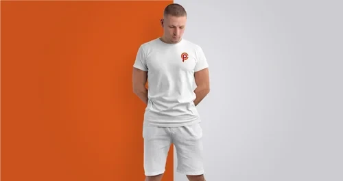
For color, we deliberately broke from the industry standard. Blues and whites dominate the men's health space, so we moved to a palette of orange, black, and red. The colors appealed directly to Dr. Cross and gave Prime Clinic an immediately distinctive visual presence that stood apart from every competitor in the space.
Messaging & Tone
The brand voice was built around directness and acceptance. Where competitors skirted around ED and sexual health issues, Prime Clinic's messaging named them plainly and framed them without stigma. This wasn't just a copywriting decision, it was a positioning strategy that ran through every touchpoint.
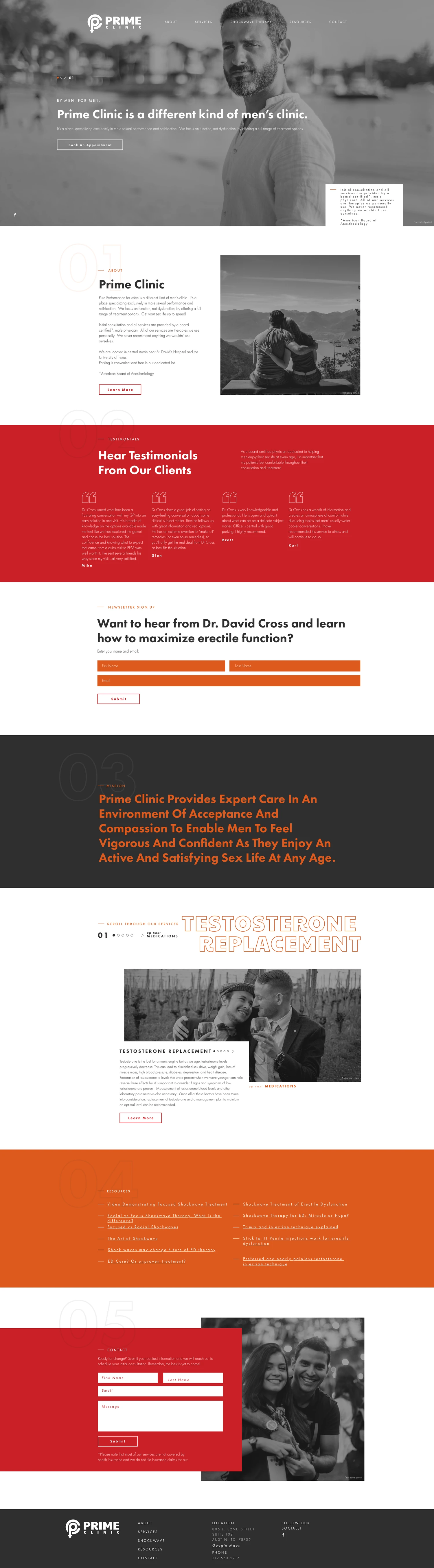
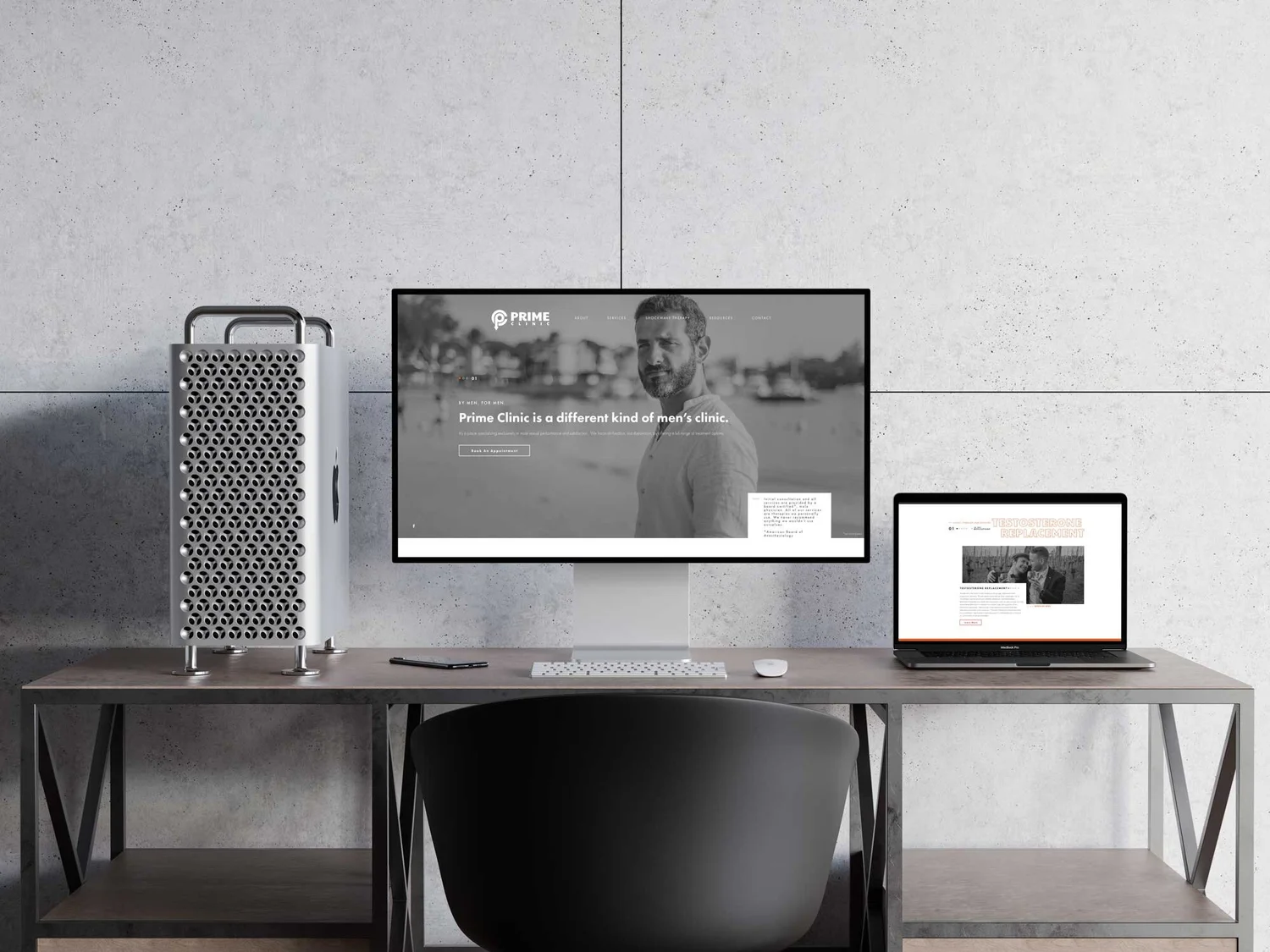
Website Structure & UX
The site was structured to reduce friction for users who might already be feeling hesitant about reaching out. Key decisions included:
Leading with the Clinc and Dr. Cross — introducing the doctor before the services, so prospective patients knew who they'd be working with and could build a sense of trust before committing to anything.
Inclusive imagery throughout — photos of both gay and straight couples were intentionally woven into the site to signal explicitly that Prime Clinic is a judgment-free practice, not just in language but visually.
Online booking integrated directly into the site — a significant functional upgrade from the previous platform, which had no booking capability at all. The ability to schedule an appointment without a phone call removed a meaningful barrier for men who might hesitate to make that first step
Outcome
The rebrand successfully repositioned Prime Clinic as a distinct, welcoming, and direct alternative in a space dominated by clinical conservatism. Dr. Cross has since retired, and the site is no longer active, but in conversations throughout the engagement, he consistently noted that the platform served him well and delivered on what the rebrand set out to do.
What I'd Do Differently
Given more time and resources, I would have pushed for even a small round of patient interviews or surveys before finalizing the messaging strategy. The discovery session with Dr. Cross was rich, but the most valuable perspective in a project like this is the patients. Understanding exactly what makes someone in this situation feel safe enough to take the first step would have made the UX and content decisions even sharper.